Chapter 1: The Basics of Styling - CSS Fundamentals

The CSS Fundamentals Sundae - A Delicious Start to Styling

CSS Fundamentals Sundae

Just like crafting the perfect sundae involves carefully selecting and layering ingredients, mastering CSS starts with understanding its fundamental concepts: syntax, selectors, and properties. This chapter introduces you to the basic building blocks of CSS, setting the foundation for your journey into the art of styling.

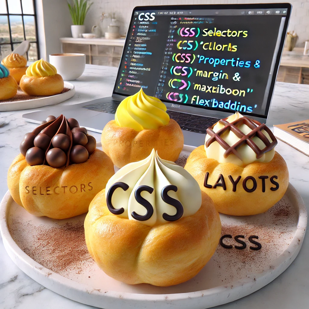
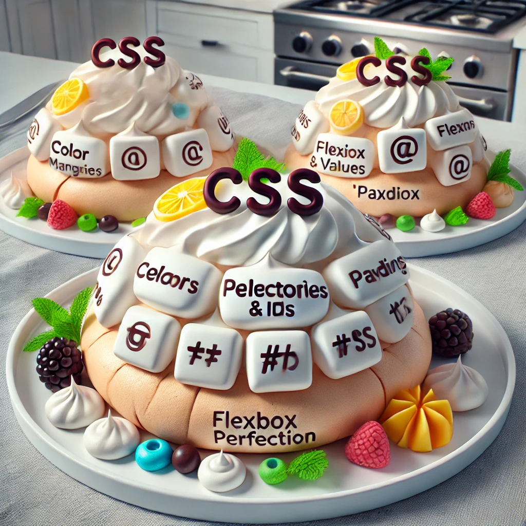
Introduction to CSS: Building Your Dessert Base

CSS, or Cascading Style Sheets, is like the base of your sundae—it provides the structure and flavor for all the elements on your webpage. It allows you to control the layout, colors, fonts, and overall appearance of your site. Here's a basic example of CSS syntax:

body {
    background-color: #f4f4f9;
    font-family: 'Raleway', sans-serif;
    color: #333;
}

This code sets the background color, font, and text color for the entire webpage, similar to choosing the type of ice cream that forms the base of your sundae.

Selectors: The Toppings of Your CSS Sundae

Selectors in CSS are like the toppings on a sundae—they allow you to target specific elements and apply styles to them. Selectors can be as simple or as specific as you need them to be:

h1 {
    color: #2c3e50;
    font-size: 2.5em;
    text-align: center;
}

p {
    line-height: 1.6;
    margin-bottom: 15px;
}

In this example, the h1 selector targets all heading elements and styles them with a specific color, font size, and alignment, while the p selector styles paragraphs, much like adding different toppings to create a unique flavor profile for your sundae.

Properties and Values: The Syrup and Sprinkles

CSS properties and values are like the syrup and sprinkles on a sundae—they add flavor and personality to your webpage. Each property defines a style (such as color, font size, or margin), while the value specifies the exact look:

a {
    text-decoration: none;
    color: #3498db;
}

a:hover {
    text-decoration: underline;
    color: #2980b9;
}

Here, the a selector targets all anchor (link) elements and removes the default underline, adding a color instead. On hover, the text becomes underlined, similar to how a drizzle of chocolate syrup enhances the sundae's presentation.

Understanding the Cascade: The Layers of Your Sundae

The cascade in CSS is like the layers of a sundae—it determines how styles are applied and layered based on specificity and importance. Understanding the cascade allows you to craft well-styled, harmonious webpages:

.important-text {
    font-weight: bold;
    color: #e74c3c;
}

#unique-paragraph {
    font-size: 1.2em;
    color: #8e44ad;
}

In this example, a class selector and an ID selector are used to style elements with different levels of specificity, much like layering different flavors and toppings in a sundae to create a unique dessert.

Your First Challenge: Create Your CSS Fundamentals Sundae

Practice using CSS selectors, properties, and values to style a simple webpage. Experiment with different selectors and the cascade to craft a visually appealing design. The more you practice, the more delicious and stylish your CSS Fundamentals Sundae will become!

Chapter 2: The Art of Colors and Backgrounds

The CSS Rainbow Cake - Layers of Colorful Design

CSS Rainbow Cake

Just as a rainbow cake delights the senses with its vibrant layers, mastering the art of colors and backgrounds in CSS allows you to create visually stunning web pages. This chapter will guide you through the use of colors, gradients, and background images to enhance your designs.

Understanding Colors in CSS: Choosing Your Cake's Layers

Colors are the foundation of your design, much like the layers of a rainbow cake. In CSS, you can define colors using various methods such as named colors, HEX codes, RGB, and HSL:

body {
            background-color: #f4f4f9;
            color: #333;
        }
        
        h1 {
            color: #e74c3c;
        }
        
        p {
            color: rgb(52, 152, 219);
        }

This code sets the background color and text color using HEX and RGB values, similar to selecting the colors for each layer of your cake.

Gradients: The Icing Between the Layers

Gradients in CSS are like the icing between the layers of your cake—they blend colors seamlessly to create smooth transitions. You can use linear and radial gradients to add depth to your backgrounds:

body {
            background: linear-gradient(to right, #ff7e5f, #feb47b);
        }
        
        header {
            background: radial-gradient(circle, #4b79a1, #283e51);
        }

In this example, a linear gradient is applied to the background of the body, while a radial gradient is used for the header, much like spreading different flavors of icing between the layers of your cake.

Background Images: The Decorative Toppings

Background images in CSS are like the decorative toppings on your cake—they add visual interest and can be customized to fit your design. You can control the size, position, and repetition of background images:

body {
            background-image: url('images/background-pattern.png');
            background-size: cover;
            background-repeat: no-repeat;
            background-position: center;
        }

This code sets a background image that covers the entire page, does not repeat, and is centered, similar to carefully placing decorations on top of your cake.

Combining Colors, Gradients, and Images: The Perfect Slice

Combining colors, gradients, and background images in CSS allows you to create a visually appealing and cohesive design, much like crafting the perfect slice of cake. Here's how you can layer these elements:

.colorful-section {
            background: linear-gradient(to bottom, rgba(255, 255, 255, 0.8), rgba(0, 0, 0, 0.8)), url('images/pattern.png');
            color: #fff;
            padding: 20px;
            text-align: center;
        }

In this example, a gradient overlay is combined with a background image to create a visually striking effect, similar to layering multiple flavors and toppings in a single slice of cake.

Your Second Challenge: Bake Your CSS Rainbow Cake

Practice using colors, gradients, and background images to style your web pages. Experiment with different color combinations and background effects to create a visually stunning design. The more you practice, the more colorful and delightful your CSS Rainbow Cake will become!

Chapter 3: Font Magic - Typography in CSS

The CSS Typography Macarons - A Sweet Touch of Font Styles

CSS Typography Macarons

Typography in CSS is like a plate of macarons—each font and style adds a unique flavor to your design. Just as macarons come in various colors and flavors, fonts and text styles can be used to enhance readability and add personality to your web pages. In this chapter, you'll explore the magical world of typography and learn how to style text in CSS.

Choosing the Right Fonts: Selecting Your Macarons

Just as you would choose the perfect flavors for your macarons, selecting the right fonts is essential for creating a visually appealing design. CSS offers various ways to define fonts, including web-safe fonts, custom fonts, and Google Fonts:

body {
                    font-family: 'Raleway', sans-serif;
                }
                
                h1 {
                    font-family: 'Playfair Display', serif;
                }

This code sets a default sans-serif font for the body and a serif font for headings, much like selecting different flavors of macarons to complement each other.

Font Size and Weight: The Texture of Your Macarons

Font size and weight in CSS determine the texture and appearance of your text, similar to the crisp shell and creamy filling of a macaron. Use these properties to control the visual hierarchy and readability of your text:

h1 {
                    font-size: 2.5em;
                    font-weight: bold;
                }
                
                p {
                    font-size: 1em;
                    font-weight: normal;
                }

In this example, the font size and weight are adjusted to create a visual hierarchy, much like choosing the size and texture of macarons to make them visually appealing.

Text Alignment and Spacing: Arranging Your Macarons

Text alignment and spacing in CSS are like arranging your macarons on a plate—they affect the overall presentation and readability of your content. Use alignment and spacing properties to create a well-organized layout:

h1 {
                    text-align: center;
                    margin-bottom: 20px;
                }
                
                p {
                    line-height: 1.6;
                    margin-bottom: 15px;
                }

This code centers the headings and sets the line height for paragraphs, similar to arranging macarons neatly on a display.

Text Decoration and Transformation: The Finishing Touches

Text decoration and transformation in CSS are like the finishing touches on your macarons—they add extra flair and style to your text. Use these properties to enhance the look of your text:

a {
                    text-decoration: none;
                    color: #3498db;
                }
                
                a:hover {
                    text-decoration: underline;
                    color: #2980b9;
                }
                
                .uppercase {
                    text-transform: uppercase;
                }

In this example, text decoration and transformation properties are used to style links and transform text to uppercase, much like adding a sprinkle of powdered sugar or a drizzle of chocolate to your macarons.

Your Third Challenge: Bake Your CSS Typography Macarons

Practice using fonts, sizes, weights, alignment, and decoration properties to style your text in CSS. Experiment with different font combinations and text styles to create a visually appealing and readable design. The more you practice, the more delightful and stylish your CSS Typography Macarons will become!

Chapter 4: Box of Secrets - The Box Model

The CSS Layer Cake - Understanding the Layers of Design

CSS Layer Cake

The CSS Box Model is like a perfectly layered cake—each layer contributes to the overall structure and appearance. Understanding the box model is essential for mastering layout and design in CSS. This chapter will guide you through the layers of the box model, including content, padding, borders, and margins.

Understanding the Box Model: The Layers of Your Cake

The CSS Box Model consists of four main layers, similar to the layers of a cake. Each layer adds to the overall structure and appearance of an element on the page:

.cake-box {
                            width: 300px;
                            padding: 20px;
                            border: 5px solid #e74c3c;
                            margin: 10px;
                            background-color: #f4f4f9;
                        }

This code sets up a box with a defined width, padding, border, and margin, similar to arranging the layers of a cake to create a cohesive design.

Content: The Core Flavor of Your Cake

The content layer is the innermost part of the box model, where your text and images are placed. It’s like the main flavor of your cake, providing the essence of the design:

.cake-content {
                            width: 100%;
                            height: auto;
                        }

This code ensures that the content layer occupies the full width of its container, just like the main flavor filling the core of a cake layer.

Padding: The Frosting Between the Layers

Padding adds space between the content and the border, much like frosting between the layers of a cake. It ensures that the content doesn't touch the borders directly:

.cake-padding {
                            padding: 20px;
                            background-color: #f9e79f;
                        }

This code adds padding around the content, creating space between the content and the border, similar to adding a layer of frosting between cake layers.

Border: The Defined Edge of Your Cake

The border is like the outer crust of a cake, providing a defined edge around the padding. You can style borders in various ways to enhance the design:

.cake-border {
                            border: 5px solid #e74c3c;
                        }

This code adds a solid border around the padding, giving the box a defined edge, much like the outer crust of a cake adds structure to the dessert.

Margin: The Space Between Cake Slices

Margin is the outermost layer of the box model, providing space between elements, similar to the spacing between slices of cake on a plate:

.cake-margin {
                            margin: 10px;
                        }

This code adds margin around the box, creating space between it and other elements, just like the space between slices of cake ensures they don’t touch each other.

Your Fourth Challenge: Bake Your CSS Layer Cake

Practice using the CSS Box Model to style a simple webpage. Experiment with different values for content, padding, border, and margin to create a well-structured and visually appealing design. The more you practice, the more refined and delicious your CSS Layer Cake will become!

Chapter 5: Flexbox Feast - Flexible Layouts Made Easy

The CSS Éclair Delight - Crafting Smooth and Flexible Layouts

CSS Eclair Delight

Just like crafting a perfect éclair requires balancing the soft, creamy filling with the delicate pastry shell, mastering Flexbox in CSS involves balancing flexible and responsive layouts. This chapter will guide you through the essential techniques of Flexbox, allowing you to create adaptable and visually appealing designs effortlessly.

Introduction to Flexbox: The Dough and Cream of Your Éclair

Flexbox, or Flexible Box Layout, is like the dough and cream of an éclair—it provides the structure and flexibility needed to create visually pleasing layouts. Flexbox allows you to align and distribute space among items in a container efficiently:

.flex-container {
                                    display: flex;
                                    justify-content: center;
                                    align-items: center;
                                    height: 100vh;
                                    background-color: #f4f4f9;
                                }

This code sets up a flex container that centers its content both horizontally and vertically, similar to how the dough and cream of an éclair balance each other perfectly.

Flex Direction and Wrapping: Rolling Out Your Pastry

The flex-direction and flex-wrap properties in Flexbox are like rolling out pastry for an éclair—they determine the layout direction and whether items wrap within the container:

.flex-container {
                                    display: flex;
                                    flex-direction: row;
                                    flex-wrap: wrap;
                                }

This code arranges items in a row and allows them to wrap to the next line if there isn’t enough space, much like rolling out pastry dough to fit the shape of an éclair.

Justify Content: Distributing Your Pastry Filling

The justify-content property in Flexbox is like distributing the filling evenly inside an éclair—it controls the alignment of items along the main axis (horizontal or vertical) within the container:

.flex-container {
                                    display: flex;
                                    justify-content: space-between;
                                }

This code spreads the items evenly across the container, similar to how you might spread filling evenly within an éclair.

Align Items and Content: Perfecting the Pastry Shape

The align-items and align-content properties in Flexbox are like shaping the pastry to ensure a perfect form for your éclair—they control the alignment of items along the cross axis:

.flex-container {
                                    display: flex;
                                    align-items: stretch;
                                    align-content: center;
                                }

This code ensures that items are stretched to fit the container height and centered along the cross axis, much like shaping an éclair to be uniform and appealing.

Order and Flex Grow: Adding the Final Touches

The order and flex-grow properties are like adding the final decorative touches to your éclair—they control the order of items and how much space they take up in the container:

.flex-item {
                                    order: 2;
                                    flex-grow: 1;
                                }

This code sets the order of a flex item and allows it to grow to fill the available space, similar to arranging and filling éclairs on a platter to create a balanced presentation.

Your Fifth Challenge: Bake Your CSS Eclair Delight

Practice using Flexbox properties to create flexible and responsive web layouts. Experiment with different values for justify-content, align-items, and flex-wrap to craft a visually appealing design. The more you practice, the more delightful and flexible your CSS Eclair Delight will become!

Chapter 6: Grid Garden - Mastering CSS Grid Layout

The CSS Tiramisu Layers - Crafting Complex, Layered Designs

CSS Tiramisu Layers

CSS Grid is like the perfect tiramisu—it’s all about layers and balance. Just as tiramisu layers flavors and textures to create a harmonious dessert, CSS Grid allows you to create complex, two-dimensional layouts with ease. This chapter will guide you through mastering CSS Grid to craft visually appealing and structured web pages.

Introduction to CSS Grid: The Ladyfingers and Mascarpone of Your Tiramisu

CSS Grid Layout is like the ladyfingers and mascarpone in a tiramisu—it provides the foundation and layers for building intricate designs. CSS Grid allows you to define rows, columns, and areas to create responsive layouts:

.grid-container {
                                            display: grid;
                                            grid-template-columns: repeat(3, 1fr);
                                            grid-template-rows: auto;
                                            gap: 20px;
                                        }

This code sets up a grid container with three equal columns and automatically sized rows, much like layering ladyfingers and mascarpone to create the base of a tiramisu.

Grid Items and Placement: Arranging Your Tiramisu Layers

The placement of grid items in CSS Grid is like arranging the layers in a tiramisu—it determines how elements are positioned within the grid container. You can place items in specific grid areas to create structured layouts:

.grid-item {
                                            grid-column: 1 / 3;
                                            grid-row: 1 / 2;
                                        }

This code positions a grid item to span from the first to the third column and from the first to the second row, similar to carefully layering ingredients in a tiramisu.

Grid Template Areas: Defining Your Tiramisu Slices

Grid template areas in CSS Grid are like defining the slices of a tiramisu—they allow you to create named grid areas for easy layout management. This technique helps you visualize and structure your grid:

.grid-container {
                                            display: grid;
                                            grid-template-areas: 
                                                "header header header"
                                                "sidebar content content"
                                                "footer footer footer";
                                        }
                                        
                                        .header {
                                            grid-area: header;
                                        }
                                        
                                        .sidebar {
                                            grid-area: sidebar;
                                        }
                                        
                                        .content {
                                            grid-area: content;
                                        }
                                        
                                        .footer {
                                            grid-area: footer;
                                        }

In this example, named grid areas are defined to create a structured layout, much like slicing a tiramisu to ensure each piece has balanced layers of flavor.

Using Grid Gap: Adding Space Between Tiramisu Layers

The grid-gap property in CSS Grid is like the space between layers of tiramisu—it adds visual separation between grid items, enhancing the design:

.grid-container {
                                            display: grid;
                                            grid-gap: 20px;
                                        }

This code adds a 20-pixel gap between grid items, similar to adding a bit of space between tiramisu layers for visual appeal.

Auto-Placement and Responsive Grids: The Perfectly Balanced Dessert

Auto-placement and responsive design in CSS Grid are like creating a perfectly balanced tiramisu that adapts to different tastes and sizes. You can create flexible grids that adjust to the screen size and content:

.responsive-grid {
                                            display: grid;
                                            grid-template-columns: repeat(auto-fit, minmax(200px, 1fr));
                                        }

This code creates a responsive grid that adjusts the number of columns based on the container width, similar to adapting the size of tiramisu slices for different servings.

Your Sixth Challenge: Build Your CSS Tiramisu Layers

Practice using CSS Grid to create complex, two-dimensional layouts. Experiment with different grid templates, item placements, and responsive design techniques to craft a visually structured webpage. The more you practice, the more intricate and balanced your CSS Tiramisu Layers will become!

Chapter 7: Advanced Styling - Pseudo-classes and Pseudo-elements

The CSS Choux Pastry Puffs - Adding Dynamic Layers of Style

CSS Choux Pastry Puffs

Pseudo-classes and pseudo-elements in CSS are like the delicate puffs of choux pastry—they add a light, airy touch to your web designs, creating dynamic and interactive styles. In this chapter, you'll explore the advanced techniques of using pseudo-classes and pseudo-elements to enhance user experiences on your web pages.

Introduction to Pseudo-classes: Light, Airy Enhancements

Pseudo-classes in CSS are like adding a light dusting of powdered sugar to your choux pastry—they enhance the visual appeal without changing the core structure. Pseudo-classes target elements based on their state or position:

a:hover {
    color: #ff6347;
    text-decoration: underline;
}

input:focus {
    border-color: #3498db;
}

In this example, the :hover pseudo-class changes the style of links when hovered over, and the :focus pseudo-class styles input fields when they are focused, much like a choux pastry becomes more appealing with a delicate garnish.

Pseudo-elements: Filling Your Pastry with Flavor

Pseudo-elements are like the creamy filling inside a choux pastry—they add substance and depth to your design by styling specific parts of an element. Common pseudo-elements include ::before and ::after:

p::first-line {
    font-weight: bold;
    color: #2c3e50;
}

p::after {
    content: '✨';
    display: inline-block;
    margin-left: 5px;
}

This code uses the ::first-line pseudo-element to style the first line of a paragraph and the ::after pseudo-element to add a decorative element after the text, similar to filling choux pastry with a flavorful cream.

Combining Pseudo-classes and Pseudo-elements: The Perfect Puff

Combining pseudo-classes and pseudo-elements in CSS allows you to create complex, dynamic styles, much like crafting the perfect puff of choux pastry by balancing the pastry and filling:

a:hover::before {
    content: '→ ';
    color: #ff6347;
}

button:active::after {
    content: 'Pressed!';
    color: #e74c3c;
    font-size: 0.8em;
}

In this example, a combination of pseudo-classes and pseudo-elements adds dynamic, interactive styles to links and buttons, enhancing the user experience like a well-crafted choux pastry delights the senses.

Advanced Styling Techniques: Crafting Your Perfect Choux Pastry Puffs

Experimenting with pseudo-classes and pseudo-elements is like perfecting the technique of making choux pastry—each tweak and adjustment adds to the final presentation. Here are some more examples:

ul li:first-child {
    font-style: italic;
}

div::before {
    content: 'Note: ';
    font-weight: bold;
    color: #ff8c00;
}

These examples use pseudo-classes to style the first list item and pseudo-elements to add a note before a div, much like adding a personalized touch to each choux pastry.

Your Seventh Challenge: Create Your CSS Choux Pastry Puffs

Practice using pseudo-classes and pseudo-elements to add dynamic and interactive styles to your web pages. Experiment with different combinations to create engaging user experiences. The more you practice, the more delicate and flavorful your CSS Choux Pastry Puffs will become!

Chapter 8: Responsive Alchemy - Media Queries and Breakpoints

The CSS Choux Pastry - Adapting to Every Device

CSS Choux Pastry

Creating responsive designs with CSS is like mastering the art of making choux pastry—it needs to be perfectly adaptable to any filling and shape. Media queries and breakpoints are the key ingredients that allow your design to adjust to different devices and screen sizes seamlessly.

Introduction to Media Queries: Shaping Your Choux Pastry

Media queries in CSS are like shaping choux pastry to fit different molds—they allow you to apply styles based on the characteristics of the user's device, such as screen size, resolution, or orientation:

@media (max-width: 768px) {
            .container {
                flex-direction: column;
            }
        }

This code applies styles only when the screen width is 768px or less, similar to adapting the shape of your choux pastry to fit different molds.

Breakpoints: The Key to Perfect Adaptability

Breakpoints in CSS are like the key moments in baking when you need to adjust the oven temperature or check the dough—they determine when a responsive layout should change:

@media (min-width: 768px) {
            .sidebar {
                display: block;
            }
        }
        
        @media (max-width: 767px) {
            .sidebar {
                display: none;
            }
        }

This code shows or hides the sidebar depending on the screen size, much like adjusting the baking process to achieve the perfect choux pastry texture.

Responsive Typography: Adjusting Your Filling

Responsive typography is like adjusting the filling of your choux pastry—it ensures that the text remains legible and visually appealing on different devices:

body {
            font-size: 16px;
        }
        
        @media (max-width: 600px) {
            body {
                font-size: 14px;
            }
        }

This code adjusts the font size for smaller screens, ensuring the text remains readable, similar to adjusting the filling consistency for different pastry sizes.

Flexible Layouts with Flexbox and Grid: The Versatile Pastry

Using Flexbox and Grid with media queries allows you to create flexible layouts that adapt to any screen size, like choux pastry that can take various forms and fillings:

@media (min-width: 1024px) {
            .grid-container {
                display: grid;
                grid-template-columns: repeat(3, 1fr);
            }
        }
        
        @media (max-width: 1023px) {
            .grid-container {
                display: flex;
                flex-direction: column;
            }
        }

This code switches between a grid layout for larger screens and a flex layout for smaller screens, much like preparing choux pastry to fit different serving styles.

Your Eighth Challenge: Bake Your CSS Choux Pastry

Practice using media queries and breakpoints to create responsive web designs. Experiment with different layout styles and typography adjustments to ensure your design adapts to any device. The more you practice, the more adaptable and versatile your CSS Choux Pastry will become!

Chapter 9: CSS Animations and Transitions - Bringing Your Page to Life

The CSS Soufflé Surprise - Rising Effects to Delight Your Audience

CSS Soufflé Surprise

Adding animations and transitions in CSS is like baking a perfect soufflé—it requires precision and timing to achieve a delightful rise and smooth texture. This chapter will guide you through the basics of CSS animations and transitions, allowing you to infuse your web pages with dynamic and captivating effects.

Introduction to CSS Transitions: The Gentle Rise of Your Soufflé

CSS transitions are like the gentle rise of a soufflé—they create smooth changes between states over a specified duration. Use transitions to add subtle animations to your elements:

.souffle-button {
                    background-color: #e74c3c;
                    transition: background-color 0.3s ease;
                }
                
                .souffle-button:hover {
                    background-color: #c0392b;
                }

This code adds a transition effect to a button, creating a smooth color change when hovered over, much like the gradual rise of a soufflé in the oven.

CSS Animations: Crafting the Perfect Soufflé Rise

CSS animations are like crafting the perfect rise of a soufflé—they allow you to create complex, multi-step animations that can repeat or alternate directions. Use keyframes to define the animation:

@keyframes souffle-rise {
                    0% {
                        transform: scale(1);
                    }
                    50% {
                        transform: scale(1.2);
                    }
                    100% {
                        transform: scale(1);
                    }
                }
                
                .souffle-element {
                    animation: souffle-rise 2s infinite;
                }

This code creates a pulsing animation effect for an element, similar to the rise and fall of a soufflé as it cooks and settles.

Combining Transitions and Animations: The Soufflé Masterpiece

Combining transitions and animations allows you to create complex and engaging effects, similar to perfecting the texture and flavor of a soufflé through careful preparation and baking:

.souffle-container {
                    animation: souffle-rise 2s infinite;
                    transition: transform 0.3s ease;
                }
                
                .souffle-container:hover {
                    transform: scale(1.1);
                }

This code uses both animations and transitions to create a dynamic effect when an element is hovered over, similar to the delicate texture and rise of a well-made soufflé.

Animating with Transformations: The Fluff of Your Soufflé

CSS transformations like rotate, scale, and translate are like adding extra fluff to your soufflé—they enhance the animation effects by transforming elements in creative ways:

@keyframes souffle-spin {
                    0% {
                        transform: rotate(0deg);
                    }
                    100% {
                        transform: rotate(360deg);
                    }
                }
                
                .spin-element {
                    animation: souffle-spin 5s linear infinite;
                }

This code applies a spinning animation to an element, similar to adding a bit of flair and fluff to a soufflé to make it stand out.

Your Ninth Challenge: Perfect Your CSS Soufflé Surprise

Practice using CSS animations and transitions to create dynamic and engaging effects on your web pages. Experiment with different keyframes, transformations, and transition properties to bring your designs to life. The more you practice, the more impressive and delightful your CSS Soufflé Surprise will become!

Chapter 10: The Power of Preprocessing - Sass and Less

The CSS Crème Brûlée - Refining Your Style with Preprocessors

CSS Crème Brûlée

Delving into preprocessors like Sass and Less is like perfecting a crème brûlée recipe—it enhances the flavor and texture of your CSS, making it more efficient and easier to maintain. This chapter will guide you through the basics of using preprocessors to streamline your CSS workflow.

Introduction to Sass and Less: The Ingredients of Your Crème Brûlée

Sass and Less are like the essential ingredients in a crème brûlée—they add depth and complexity to your CSS, making it more powerful and easier to manage. Preprocessors extend the capabilities of regular CSS with features like variables, nesting, and mixins:

$primary-color: #e74c3c;
                        $secondary-color: #f4f4f9;
                        
                        body {
                            background-color: $secondary-color;
                            color: $primary-color;
                        }

This Sass code defines color variables that make it easy to maintain and update your styles, similar to how key ingredients ensure the perfect flavor in a crème brûlée.

Nesting and Modularity: The Layering of Your Dessert

Nesting in Sass and Less is like layering a crème brûlée—it allows you to structure your styles in a clear and hierarchical manner. Use nesting to keep your CSS organized and modular:

.creme-brulee {
                            background-color: $secondary-color;
                            color: $primary-color;
                        
                            .topping {
                                font-weight: bold;
                                text-transform: uppercase;
                            }
                        }

This code nests styles within the .creme-brulee class, similar to layering different components of a crème brûlée to create a rich, multi-dimensional dessert.

Mixins: The Secret Recipe for Consistency

Mixins in Sass are like a secret recipe for the perfect crème brûlée—they allow you to reuse styles throughout your stylesheet, ensuring consistency and reducing repetition:

@mixin rounded-corners($radius) {
                            border-radius: $radius;
                        }
                        
                        .creme-brulee {
                            @include rounded-corners(10px);
                        }

This code uses a mixin to apply rounded corners to elements, similar to using a consistent technique to achieve the perfect texture in every crème brûlée.

Extending and Inheritance: Sharing Your Ingredients

The @extend directive in Sass is like sharing your ingredients between multiple crème brûlées—it allows you to extend styles from one selector to another, reducing duplication and ensuring consistency:

.base-style {
                            background-color: $secondary-color;
                            color: $primary-color;
                        }
                        
                        .creme-brulee {
                            @extend .base-style;
                            padding: 20px;
                        }

This code extends the base styles to the .creme-brulee class, similar to using the same foundational ingredients across multiple crème brûlée recipes.

Your Tenth Challenge: Create Your CSS Crème Brûlée

Practice using Sass or Less to enhance your CSS with variables, nesting, mixins, and inheritance. Experiment with different features to streamline your styles and make your code more efficient. The more you practice, the more refined and delightful your CSS Crème Brûlée will become!

Chapter 11: CSS Tricks and Hacks - Mastering Advanced Techniques

The CSS Chocolate Fondant - Decadent Solutions for Complex Challenges

CSS Chocolate Fondant

Mastering advanced CSS techniques is like crafting the perfect chocolate fondant—it's all about precision, timing, and using the right tricks to achieve a decadent result. This chapter will guide you through some advanced CSS tricks and hacks that can help you solve complex design challenges and optimize performance.

Introduction to Advanced CSS Techniques: The Art of Chocolate Fondant

Advanced CSS techniques are like the art of making a chocolate fondant—getting the molten center just right requires skill and precision. Here, we’ll explore some CSS tricks that can elevate your designs and help you achieve that perfect balance between form and function:

.fondant-box {
                                    box-sizing: border-box;
                                    width: 100%;
                                    max-width: 400px;
                                    margin: 0 auto;
                                    padding: 20px;
                                    background-color: #f4f4f9;
                                    border: 1px solid #ccc;
                                }

This code ensures that the width of your elements is calculated including padding and borders, similar to how precise measurements are key to a successful chocolate fondant.

CSS Variables: The Secret Ingredients

CSS variables, also known as custom properties, are like secret ingredients in your chocolate fondant—they allow you to store values and reuse them throughout your stylesheet, making your code more maintainable:

:root {
                                    --primary-color: #e74c3c;
                                    --secondary-color: #f4f4f9;
                                }
                                
                                .fondant-box {
                                    background-color: var(--secondary-color);
                                    color: var(--primary-color);
                                }

This code uses CSS variables to define colors, making it easy to update your design by changing a single value, much like tweaking a recipe to perfect your fondant.

Flexbox and Grid Hacks: Structuring Your Dessert

Using Flexbox and Grid in creative ways is like structuring the layers of your chocolate fondant to ensure it holds its shape and oozes with perfection. Here are a few hacks:

.fondant-container {
                                    display: flex;
                                    flex-direction: column;
                                    justify-content: center;
                                    align-items: center;
                                }
                                
                                .grid-container {
                                    display: grid;
                                    grid-template-columns: repeat(auto-fill, minmax(150px, 1fr));
                                    gap: 20px;
                                }

This code demonstrates how to use Flexbox and Grid to create responsive layouts that adapt to different screen sizes, ensuring your design is as smooth and satisfying as the perfect chocolate fondant.

Pseudo-Classes and Pseudo-Elements: Adding the Final Touch

Pseudo-classes and pseudo-elements are like adding a dusting of powdered sugar or a drizzle of sauce to your fondant—they add the final touch that makes your design stand out:

.fondant-box::before {
                                    content: '🍫';
                                    display: block;
                                    text-align: center;
                                    font-size: 2em;
                                    margin-bottom: 10px;
                                }
                                
                                .fondant-box:hover {
                                    background-color: #e74c3c;
                                    color: #fff;
                                }

This code adds decorative elements and hover effects, similar to the finishing touches on a plated chocolate fondant that make it visually appealing.

Your Eleventh Challenge: Craft Your CSS Chocolate Fondant

Practice using advanced CSS techniques to solve complex design challenges and optimize your code. Experiment with CSS variables, Flexbox, Grid, and pseudo-elements to create efficient, maintainable, and visually stunning designs. The more you practice, the more skilled you will become at crafting the perfect CSS Chocolate Fondant!

Chapter 12: The Future of CSS - New Features and Trends

The CSS Pavlova Perfection - Innovating Your Design with the Latest CSS Trends

CSS Pavlova Perfection

Staying up-to-date with the latest CSS innovations is like perfecting a pavlova—every new feature adds a layer of sophistication and delight. This chapter will explore the newest CSS features and trends that are shaping the future of web design, helping you stay ahead in your creative journey.

Introduction to New CSS Features: The Ingredients of Your Pavlova

New CSS features are like the fresh ingredients in a pavlova—they add modern flair and enhance the overall experience. With CSS evolving rapidly, features like CSS Grid Level 2, Subgrid, CSS Custom Properties, and CSS Houdini are revolutionizing web design:

/* CSS Custom Properties */
                                        :root {
                                            --primary-color: #3498db;
                                            --secondary-color: #f4f4f9;
                                        }
                                        
                                        body {
                                            color: var(--primary-color);
                                            background-color: var(--secondary-color);
                                        }

This code uses CSS Custom Properties (variables) to make styling more flexible and manageable, similar to selecting the freshest fruits and ingredients for a pavlova.

CSS Grid Level 2 and Subgrid: Structuring the Perfect Layers

CSS Grid Level 2 introduces the subgrid property, allowing for even more control over nested grid layouts, much like arranging layers of meringue and cream in a pavlova:

.grid-container {
                                            display: grid;
                                            grid-template-columns: repeat(3, 1fr);
                                            gap: 20px;
                                        }
                                        
                                        .grid-item {
                                            display: grid;
                                            grid-template-columns: subgrid;
                                        }

This code demonstrates how to use the subgrid property to create nested grid layouts, similar to perfectly layering a pavlova with meringue, cream, and fruits.

CSS Houdini: The Pavlova's Decorative Finish

CSS Houdini is like adding the final decorative touches to a pavlova—it provides low-level APIs that allow developers to extend CSS, creating custom styles and effects that were previously impossible:

/* Using CSS Houdini to register a custom property */
                                        CSS.registerProperty({
                                            name: '--pavlova-curve',
                                            syntax: '<number>',
                                            initialValue: 0,
                                            inherits: true
                                        });
                                        
                                        /* Applying the custom property */
                                        .element {
                                            background: paint(pavlova-effect);
                                        }

This example demonstrates how to use CSS Houdini to create custom properties and paint worklets, allowing for unique styles and effects, much like adding delicate swirls and garnishes to a pavlova.

Container Queries: Adapting to Different Sizes, Like Adjusting Your Pavlova

Container queries allow elements to adapt to the size of their container, similar to adjusting a pavlova recipe to fit different serving platters:

@container (min-width: 400px) {
                                            .pavlova-content {
                                                font-size: 1.5rem;
                                            }
                                        }

This code applies styles based on the container's size, much like adapting a pavlova's presentation for different settings and occasions.

Your Twelfth Challenge: Create Your CSS Pavlova Perfection

Practice using the latest CSS features and trends to enhance your web designs. Experiment with CSS Custom Properties, Subgrid, Houdini, and Container Queries to stay ahead of the curve. The more you practice, the more innovative and refined your CSS Pavlova Perfection will become!