Chapter 1: The Alchemist's Table - Understanding HTML Elements

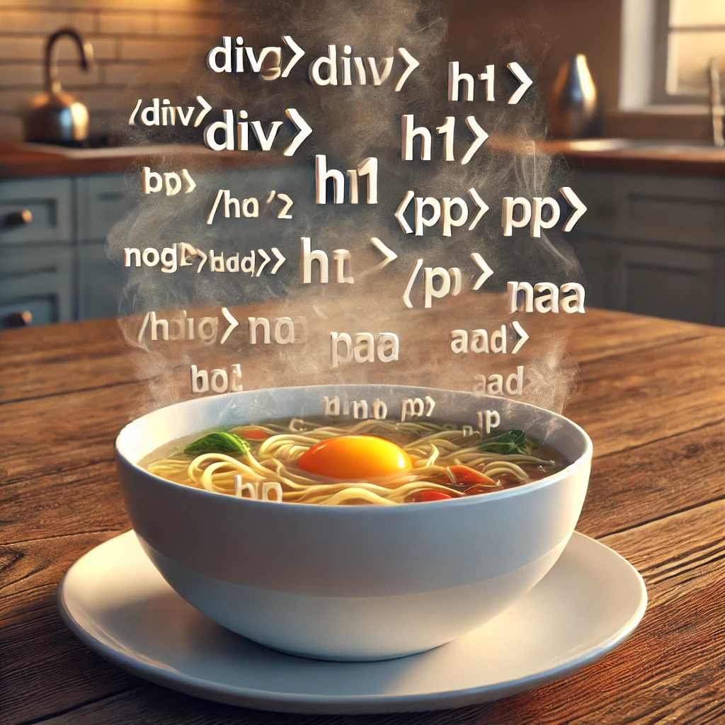
The HTML Elements Soup - A Warm Start to Your HTML Journey

HTML Elements Soup

Just like a hearty soup with a mix of essential ingredients, HTML elements form the building blocks of any webpage. This chapter will warm you up with the basics of HTML elements, their purpose, and how they work together to create the structure of the web.

Introduction to HTML Elements: Preparing Your Soup Base

HTML elements are like the vegetables, broth, and spices in a soup—they each serve a unique purpose and come together to create something greater. In this chapter, we'll explore the fundamental HTML elements and how they form the base of every webpage.

The <div> and <span> Tags: The Broth of Your Soup

The <div> and <span> elements are like the broth of your soup—they provide the basic structure and allow you to organize content:

<div>
    This is a block-level container, like a large spoonful of broth.
</div>

<span>This is an inline container, like a single spice in the mix.</span>

Use <div> for block-level content and <span> for inline content, just as you would use broth to hold the main ingredients in your soup.

Headings and Paragraphs: The Vegetables of Your Soup

Headings and paragraphs are like the vegetables in your soup—they provide substance and flavor, guiding the reader through your content:

<h1>Main Heading</h1>
<h2>Subheading</h2>
<p>This is a paragraph, adding detail and flavor to the content.</p>

These elements help structure your content in a meaningful way, much like vegetables make the soup hearty and nutritious.

Your First Recipe: Crafting an HTML Elements Soup

Start by creating a simple HTML page using the basic elements discussed. Combine headings, paragraphs, and containers to create a structured, meaningful document. The more you practice, the more flavorful your HTML Elements Soup will become!

Chapter 2: Setting Up Your Cauldron

The Developer’s Brew - Crafting Your Perfect Coding Setup

Developer's Brew

Learn how to set up your development environment, including choosing the right code editor and using the browser console as your first magical tool. Just like crafting a perfect brew, setting up your cauldron is the first step to mastering JavaScript.

Choosing Your Magical Tools: The Right Code Editor

Every great wizard needs a set of reliable tools, and in the realm of JavaScript, your primary tool is your code editor. Think of it as your wand—a device that channels your magical energy into spells, or in this case, into code.

There are several excellent code editors available, each with its own strengths and unique features. Some popular choices among seasoned wizards include:

Visual Studio Code (VS Code)

A favorite among many, Visual Studio Code offers a wide range of extensions that enhance its functionality. It supports syntax highlighting, code completion, and has a built-in terminal. Its flexibility makes it a perfect choice for both beginners and advanced coders alike.

Sublime Text

Sublime Text is known for its speed and ease of use. It is lightweight, which means it runs smoothly even on older machines. Its simplicity is deceptive, however, as it still packs powerful features like multiple selection and command palette.

Atom

Atom is another popular choice that offers a high level of customization. It’s open-source and comes with a range of packages that you can install to tailor it to your specific needs. It’s a fantastic choice for those who like to tweak their tools to perfection.

Preparing Your Workspace: Setting Up the Browser Console

With your code editor chosen, it's time to set up your browser's JavaScript console—your magical cauldron where the real magic happens. The console is a built-in tool in every modern browser that allows you to write, test, and debug JavaScript code in real-time.

Here’s how you can open your browser’s console:

First, open your chosen web browser. Modern browsers like Chrome, Firefox, Safari, or Edge are all equipped with powerful developer tools, including the console. To open the console, press Ctrl + Shift + J on Windows or Cmd + Option + J on a Mac. This magical shortcut will reveal the console, a mystical space where you can type and execute JavaScript commands directly.

Your First Tool: Experimenting with the Console

The console is more than just a space for running commands; it's your laboratory, a place to experiment and see the immediate effects of your spells. Let’s try a simple experiment to test if your setup is working correctly.

In the console, type the following command and press Enter:

console.log('Is this thing on?');

If your console returns Is this thing on?, congratulations! You've successfully cast your first spell in your new environment. This response means that your cauldron is set up perfectly, and you’re ready to start brewing more complex spells.

Enhancing Your Cauldron: Developer Tools and Extensions

Just as a wizard might enhance their cauldron with enchantments and runes, you can enhance your coding environment with tools and extensions. Here are a few must-have extensions that every budding JavaScript wizard should consider adding to their setup:

Live Server

This extension for VS Code allows you to launch a development local server with a live reload feature for static and dynamic pages. It’s perfect for viewing your HTML, CSS, and JavaScript changes in real-time as you develop your spells.

Prettier

Prettier is a code formatter that helps keep your code neat and consistent. It’s like having a spellbook that automatically arranges itself neatly on your bookshelf—essential for keeping your code readable and error-free.

Debugger for Chrome

This tool enables you to debug JavaScript code directly from VS Code. It provides all the power of Chrome DevTools in your editor, making it easier to trace and fix errors in your spells.

Your Second Challenge: Customizing Your Setup

Now that you have your tools ready, it's time for you to start customizing your environment. Install the extensions mentioned above and explore their features. Tweak your settings to match your coding style, and get comfortable using the console and editor together.

Remember, a well-organized workspace is the first step to casting flawless spells. Take your time to explore each tool and become familiar with their quirks and features. The more you practice, the more powerful your JavaScript magic will become.
Chapter 3: The Magical Scroll - Structuring Your Page

The HTML Structure Quiche - A Savory Base for Your Web Content

HTML Structure Quiche

Like a well-baked quiche that holds together various ingredients, structuring your page with HTML ensures all elements are well-placed and cohesive. This chapter will guide you through the process of creating a solid structure for your web content.

Structuring Your Page: Building the Crust of Your Quiche

The structure of an HTML page is like the crust of a quiche—it provides a solid foundation for adding content. Learn how to use semantic elements like <header>, <main>, <footer>, and others to create a well-organized page structure:

<header>
                    <h1>Welcome to the Magical HTML Kitchen</h1>
                </header>
                <main>
                    <p>Content goes here...</p>
                </main>
                <footer>
                    <p>Footer information here...</p>
                </footer>

These elements help you organize content logically, providing a strong base like a quiche crust.

Combining Elements: Filling Your Quiche with HTML Goodness

Once the structure is in place, it's time to add the filling—your HTML content. Use headings, paragraphs, images, and other elements to fill your webpage, just as you would add vegetables, cheese, and eggs to a quiche:

<article>
                    <h2>About Our Recipes</h2>
                    <p>Discover delicious HTML-based meals for your web development journey.</p>
                </article>

This approach ensures a well-structured, visually appealing webpage, much like a perfectly baked quiche.

Your Third Challenge: Bake an HTML Structure Quiche

Try creating a structured webpage using the elements and techniques covered in this chapter. The more you practice, the more your HTML skills will solidify, much like the ingredients in a savory quiche!

Chapter 4: The Enchanted Potions - Text Formatting and Links

The HTML Formatting Pasta - Adding Rich Flavors with Text and Links

HTML Formatting Pasta

Just like a delicious pasta dish that combines various sauces and toppings to create a satisfying meal, text formatting and links in HTML add flavor and interactivity to your web pages. Learn how to style text and create engaging links that guide users through your site.

Introduction to Text Formatting: Cooking the Perfect Pasta

Text formatting in HTML is like preparing the perfect pasta dish—you need to balance ingredients like bold, italics, and headings to create visually appealing and readable content. Let's explore the key tags used to format text:

<p>This is a paragraph with <strong>bold</strong> and <em>italic</em> text.</p>
                        <h1>Main Heading</h1>
                        <h2>Subheading</h2>

These tags help you enhance the appearance of text, much like sauces and toppings enhance the flavor of pasta.

Creating Links: Adding Tasty Toppings to Your Dish

Links in HTML are like the toppings on your pasta—they add variety and make the experience more engaging. Use the <a> tag to create hyperlinks that guide users to other pages or sections:

<a href="https://example.com">Visit Example</a>
                        <a href="#section2">Go to Section 2</a>

The href attribute specifies the destination, adding flavor and functionality to your webpage just like toppings add zest to pasta.

Using Lists for Better Organization: The Pasta Types

Lists in HTML help organize content, much like different pasta shapes serve different types of sauces. Use ordered and unordered lists to structure information clearly:

<ul>
                            <li>Spaghetti</li>
                            <li>Penne</li>
                            <li>Fettuccine</li>
                        </ul>
                        
                        <ol>
                            <li>Boil Water</li>
                            <li>Add Pasta</li>
                            <li>Cook for 10 minutes</li>
                        </ol>

These list elements help organize your content into easy-to-digest sections, just as different pasta shapes provide a varied culinary experience.

Anchoring Links and Creating Navigation: The Sauce that Binds

Anchors and navigation links are like the sauce that binds all the ingredients of your pasta dish. Use anchors to create smooth navigation within your webpage:

<a href="#top">Back to Top</a>
                        <div id="top">Welcome to the Top of the Page!</div>

These anchors provide a seamless navigation experience, just as a good sauce binds all the flavors in your pasta.

Your Fourth Challenge: Create an HTML Formatting Pasta

Combine various text formatting and linking techniques to craft a rich, engaging webpage. Use headings, paragraphs, bold, italics, and links to create an interactive and visually appealing layout. The more you practice, the more flavorful your HTML Formatting Pasta will become!

Chapter 5: Mystical Symbols - Lists and Navigation

The HTML Navigation Stew - Stirring Up Lists and Menus

HTML Navigation Stew

Much like a hearty stew combines various ingredients for a satisfying meal, lists and navigation elements in HTML work together to create a seamless and engaging browsing experience. This chapter will teach you how to stir up effective lists and menus that enhance your web pages.

Introduction to Lists: The Ingredients of Your Stew

Lists in HTML are like the main ingredients in a stew—they provide structure and content in a clear, digestible format. There are two primary types of lists in HTML: ordered lists and unordered lists:

<ul>
        <li>Carrots</li>
        <li>Potatoes</li>
        <li>Beef</li>
    </ul>
    
    <ol>
        <li>Chop vegetables</li>
        <li>Add to pot</li>
        <li>Simmer until cooked</li>
    </ol>

Use unordered lists for non-sequential items (like stew ingredients) and ordered lists for sequential steps (like a recipe).

Navigation Bars: Stirring Your Stew with Menus

Navigation bars are like the spoon that stirs your stew—essential for mixing content and guiding users through your site. Use the <nav> element to create navigation menus:

<nav>
        <ul>
            <li><a href="index.html">Home</a></li>
            <li><a href="about.html">About</a></li>
            <li><a href="contact.html">Contact</a></li>
        </ul>
    </nav>

This example shows a basic navigation bar using an unordered list, similar to stirring a stew to mix ingredients evenly.

Using Semantic Elements for Navigation: Adding Spices to Your Stew

Using semantic elements like <nav> enhances the accessibility and SEO of your webpage, much like adding spices improves the flavor of a stew. Always use semantic elements to provide context to your content:

<nav>
        <ul>
            <li><a href="#recipes">Recipes</a></li>
            <li><a href="#tips">Cooking Tips</a></li>
            <li><a href="#ingredients">Ingredients</a></li>
        </ul>
    </nav>

These elements help screen readers and search engines better understand your site's structure, much like spices bring out the best in a stew.

Creating Dropdown Menus: The Secret Ingredients

Dropdown menus are like secret ingredients that add depth to your navigation stew. Use CSS and JavaScript to create interactive dropdowns for a richer user experience:

<nav>
        <ul>
            <li><a href="#">Menu</a>
                <ul>
                    <li><a href="appetizers.html">Appetizers</a></li>
                    <li><a href="main-course.html">Main Course</a></li>
                    <li><a href="desserts.html">Desserts</a></li>
                </ul>
            </li>
        </ul>
    </nav>

This code demonstrates how to add dropdown functionality to your navigation, like adding a hidden spice to enhance the stew's flavor.

Your Fifth Challenge: Cook Up an HTML Navigation Stew

Practice creating various types of lists and navigation menus. Experiment with dropdowns and semantic elements to craft a comprehensive navigation system for your site. The more you practice, the more delicious and functional your HTML Navigation Stew will become!

Chapter 6: The Wizard's Chest - Images and Multimedia

The HTML Multimedia Casserole - A Rich Blend of Images and Videos

HTML Multimedia Casserole

Just like a delicious casserole that combines various ingredients to create a rich, hearty dish, multimedia elements like images, videos, and audio add depth and interactivity to your web pages. This chapter will teach you how to incorporate multimedia into your HTML for a more engaging user experience.

Introduction to Multimedia: Preparing Your Casserole Base

Multimedia elements in HTML are like the key ingredients in a casserole—they provide a rich, diverse experience that enhances the overall flavor. Let's start by adding images, which are the vegetables of your multimedia casserole:

<img src="images/vegetables.png" alt="A variety of vegetables" width="300" height="200" />

The src attribute specifies the image source, while the alt attribute provides alternative text for accessibility, similar to preparing the base ingredients for your casserole.

Embedding Videos: The Meat of Your Casserole

Videos are like the meat in your casserole—they add substance and depth. Use the <video> element to embed videos directly into your HTML:

<video width="320" height="240" controls>
            <source src="video/cooking-tutorial.mp4" type="video/mp4">
            Your browser does not support the video tag.
        </video>

The controls attribute adds playback controls, making the video interactive, much like adding meat to enrich your casserole.

Adding Audio: The Herbs and Spices

Audio elements are like the herbs and spices in a casserole—they enhance the flavor and add an extra dimension. Use the <audio> element to add sound to your webpage:

<audio controls>
            <source src="audio/background-music.mp3" type="audio/mpeg">
            Your browser does not support the audio element.
        </audio>

Adding audio elements provides an engaging auditory experience, similar to how herbs and spices enhance the taste of a casserole.

Using the <figure> and <figcaption>: The Garnish on Your Casserole

The <figure> and <figcaption> elements are like the garnish on a casserole—they provide context and enhance the presentation. Use them to group images and captions:

<figure>
            <img src="images/dish.png" alt="A delicious casserole dish" />
            <figcaption>A hearty casserole filled with vegetables, meat, and spices.</figcaption>
        </figure>

These elements help provide additional information, much like garnishing adds to the appeal of a casserole.

Your Sixth Challenge: Create an HTML Multimedia Casserole

Practice incorporating various multimedia elements into your HTML pages. Experiment with images, videos, audio, and the <figure> element to craft a visually and audibly rich experience. The more you experiment, the more flavorful and engaging your HTML Multimedia Casserole will become!

Chapter 7: Crafting with Forms - User Input and Interactions

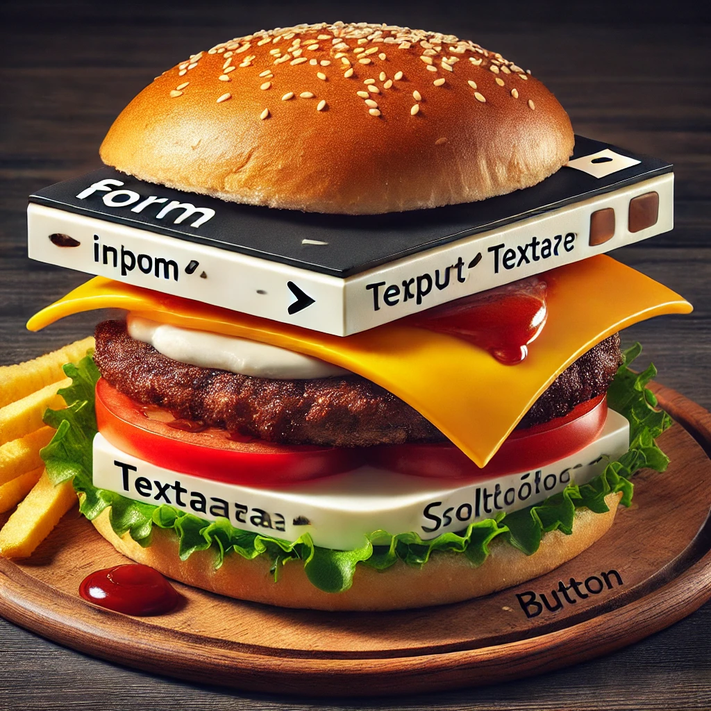
The HTML Form Burger - Stacking Input Layers for User Interaction

HTML Form Burger

Just like a delicious burger is crafted by stacking various ingredients to create a perfect bite, HTML forms are built by layering different input elements to capture user data effectively. This chapter will guide you through creating interactive forms to enhance user experience on your web pages.

Introduction to HTML Forms: Building the Bun and Layers

HTML forms are like the buns of a burger—they hold all the ingredients together, allowing users to interact with your webpage. Let's start with a basic form structure:

<form action="/submit" method="post">
                <label for="name">Name:</label>
                <input type="text" id="name" name="name" />
                <input type="submit" value="Submit" />
            </form>

The <form> element defines the form, while <input> elements are the layers of ingredients, like the patties, cheese, and veggies in a burger.

Input Elements: The Patties and Cheese

Input elements are like the patties and cheese in a burger—they provide the main substance. Use various types of inputs to gather different kinds of user data:

<input type="text" placeholder="Enter your name" />
            <input type="email" placeholder="Enter your email" />
            <input type="password" placeholder="Enter your password" />

These inputs are essential for capturing user information, much like patties and cheese are crucial to a burger's taste and texture.

Checkboxes and Radio Buttons: The Crunchy Toppings

Checkboxes and radio buttons add a crunch to your form, much like lettuce or pickles add texture to a burger. Use these elements to allow users to make multiple or single selections:

<label><input type="checkbox" name="topping" value="lettuce"> Lettuce</label>
            <label><input type="checkbox" name="topping" value="tomato"> Tomato</label>
            
            <label><input type="radio" name="sauce" value="ketchup"> Ketchup</label>
            <label><input type="radio" name="sauce" value="mustard"> Mustard</label>

These elements help provide choices, adding variety and crunch to your form, just like toppings in a burger.

Select Menus: The Secret Sauce

Select menus are like the secret sauce that adds flavor to your form—they provide a dropdown list of options for users to choose from:

<label for="burger-size">Choose a size:</label>
            <select id="burger-size" name="size">
                <option value="small">Small</option>
                <option value="medium">Medium</option>
                <option value="large">Large</option>
            </select>

Using select menus adds flexibility to your forms, much like a secret sauce enhances a burger's flavor profile.

Textarea and Buttons: The Final Touch

The <textarea> and buttons are the final touches to your form, like the top bun and condiments that complete a burger:

<textarea name="comments" rows="4" cols="50">Enter your comments here...</textarea>
            <button type="submit">Order Now</button>

These elements complete your form, providing a means for users to input larger text and submit the form, much like finishing a burger with the top bun and condiments.

Your Seventh Challenge: Stack Your Own HTML Form Burger

Try creating a form with various input elements, checkboxes, radio buttons, select menus, and buttons. Experiment with different layouts and functionalities to build a comprehensive, interactive form. The more you practice, the more delicious and engaging your HTML Form Burger will become!

Chapter 8: The Sacred Seal - Semantic Elements and Accessibility

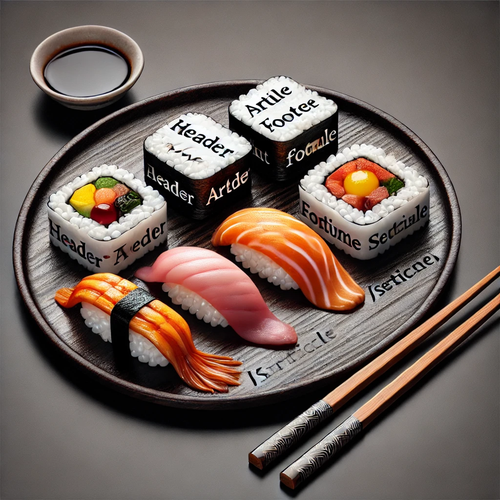
The HTML Semantic Sushi - Precise Cuts for Better Accessibility

HTML Semantic Sushi

Just like a carefully crafted sushi roll uses the freshest ingredients to create a balanced and delicious meal, semantic HTML elements provide meaning and structure to your web content, enhancing both accessibility and SEO. Learn how to use semantic elements to create a well-structured and inclusive web experience.

Introduction to Semantic Elements: Crafting Your Sushi Rolls

Semantic HTML elements are like the fish, rice, and seaweed in a sushi roll—they provide essential structure and meaning, making your content easier to understand for both users and search engines. Some key semantic elements include:

<header>
                        <h1>Welcome to Our Sushi Menu</h1>
                    </header>
                    
                    <main>
                        <article>
                            <h2>The Art of Sushi Making</h2>
                            <p>Learn the techniques to craft perfect sushi rolls...</p>
                        </article>
                    </main>
                    
                    <footer>
                        <p>Contact us at info@sushi.com</p>
                    </footer>

These elements help provide context and meaning, much like each ingredient contributes to the overall flavor of a sushi roll.

Improving Accessibility: The Wasabi and Ginger of Your Sushi Plate

Accessibility in HTML is like the wasabi and ginger served with sushi—it enhances the experience and makes it enjoyable for everyone. Use semantic elements to improve accessibility for screen readers and assistive technologies:

<nav>
                        <ul>
                            <li><a href="#home">Home</a></li>
                            <li><a href="#menu">Menu</a></li>
                            <li><a href="#contact">Contact</a></li>
                        </ul>
                    </nav>

The <nav> element, for example, helps assistive technologies identify navigation sections, making your content more accessible.

Using <section>, <article>, and <aside>: The Rice, Fish, and Nori of Semantic HTML

These semantic elements are like the key ingredients in sushi—they provide structure and flavor to your web content:

<section>
                        <h2>About Our Sushi Chefs</h2>
                        <p>Meet the masters behind our exquisite sushi...</p>
                    </section>
                    
                    <article>
                        <h3>Sushi Preparation Techniques</h3>
                        <p>Learn the art of sushi preparation from our experienced chefs...</p>
                    </article>
                    
                    <aside>
                        <p>Fun Fact: Sushi originated in Japan as a way to preserve fish.</p>
                    </aside>

Using these elements adds semantic meaning to your content, much like selecting high-quality ingredients for sushi.

Creating Accessible Forms: The Soy Sauce That Completes the Meal

Accessible forms in HTML are like the soy sauce served with sushi—they complement the experience and make it more enjoyable. Use labels and input elements to create accessible forms:

<form>
                        <label for="name">Name:</label>
                        <input type="text" id="name" name="name" />
                    
                        <label for="email">Email:</label>
                        <input type="email" id="email" name="email" />
                    
                        <button type="submit">Submit</button>
                    </form>

Properly labeling form elements ensures they are accessible to all users, much like soy sauce enhances the flavor of sushi.

Your Eighth Challenge: Create an HTML Semantic Sushi Plate

Practice using semantic HTML elements to enhance the structure and accessibility of your web pages. Experiment with <header>, <main>, <footer>, <section>, <article>, and <aside> to create a well-structured and meaningful webpage. The more you practice, the more refined and inclusive your HTML Semantic Sushi Plate will become!

Chapter 9: The Responsive Incantations - Introduction to HTML5 and CSS

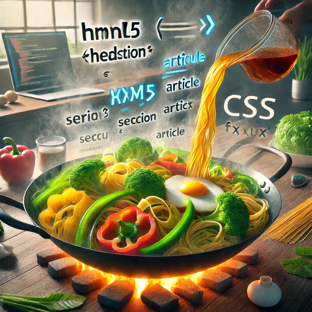
The HTML5 and CSS Stir-Fry - A Quick and Versatile Dish for Every Device

HTML5 and CSS Stir-Fry

Just like a delicious stir-fry that's quick to make and adaptable to any ingredients on hand, HTML5 and CSS provide the flexibility to create responsive web designs that adapt to any device. In this chapter, you'll learn how to use these modern web technologies to build flexible, responsive layouts.

Introduction to HTML5: The Base of Your Stir-Fry

HTML5 provides the foundational structure for your web pages, much like the base ingredients of a stir-fry hold all the flavors together. It introduces new semantic elements, form controls, and multimedia capabilities that enhance the web experience:

<header>
                                <h1>Welcome to the Ultimate Stir-Fry Guide</h1>
                            </header>
                            
                            <section>
                                <h2>Why HTML5?</h2>
                                <p>HTML5 introduces new elements that provide better structure and accessibility...</p>
                            </section>

These new elements help you build a solid foundation for your content, just as fresh ingredients create a flavorful stir-fry base.

Understanding CSS: The Sauce that Ties Everything Together

CSS (Cascading Style Sheets) is like the sauce in your stir-fry—it adds flavor, style, and visual appeal. With CSS, you can control the layout, colors, fonts, and spacing of your web content:

body {
                                background-color: #f4f4f9;
                                font-family: 'Raleway', sans-serif;
                            }
                            
                            h1, h2 {
                                color: #333;
                                text-align: center;
                            }

This CSS code sets a light background color and centers the text, much like stirring in sauce to coat all the ingredients in a stir-fry evenly.

Media Queries: The Vegetables for Every Taste

Media queries in CSS are like the vegetables you add to a stir-fry—they allow you to adapt the layout to different screen sizes and devices. Use media queries to create responsive designs:

@media (max-width: 600px) {
                                body {
                                    font-size: 14px;
                                }
                            
                                .chapter-meal-image {
                                    width: 100%;
                                    height: auto;
                                }
                            }

This media query adjusts the font size and image width for smaller screens, just like adding different vegetables to suit different tastes.

Flexbox and Grid: The Quick Cooking Techniques

Flexbox and Grid are powerful CSS layout models that allow you to create flexible, responsive designs. Think of them as the quick cooking techniques that let you prepare a delicious stir-fry in minutes:

.container {
                                display: flex;
                                flex-wrap: wrap;
                                justify-content: space-around;
                            }
                            
                            .grid-container {
                                display: grid;
                                grid-template-columns: repeat(3, 1fr);
                                gap: 10px;
                            }

These tools help you create responsive layouts that look great on any device, much like using a hot wok to stir-fry ingredients quickly and evenly.

Your Ninth Challenge: Cook Up an HTML5 and CSS Stir-Fry

Practice using HTML5 and CSS to create responsive web pages that adapt to different devices. Experiment with media queries, Flexbox, and Grid to craft a versatile, flexible layout. The more you practice, the more delicious and adaptable your HTML5 and CSS Stir-Fry will become!